BRANDS
  • View All
BRANDS
  • View All
BRANDS
  • View All
FIND A SHOWROOM
BUY ONLINE
INSPIRATION
Products
Brands
Where to Buy
Search
Everyday Modern

Quotidian Corbett

Dark Exteriors

Setting the Scene for Outdoor Entertainment

Transitional Essentials

Mixing Modern and Traditional Elements

August 15, 2018
img

Transitional Essentials

Mixing Modern and Traditional Elements

August 15, 2018

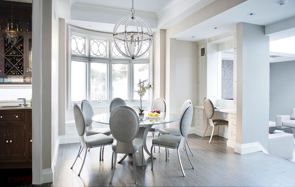
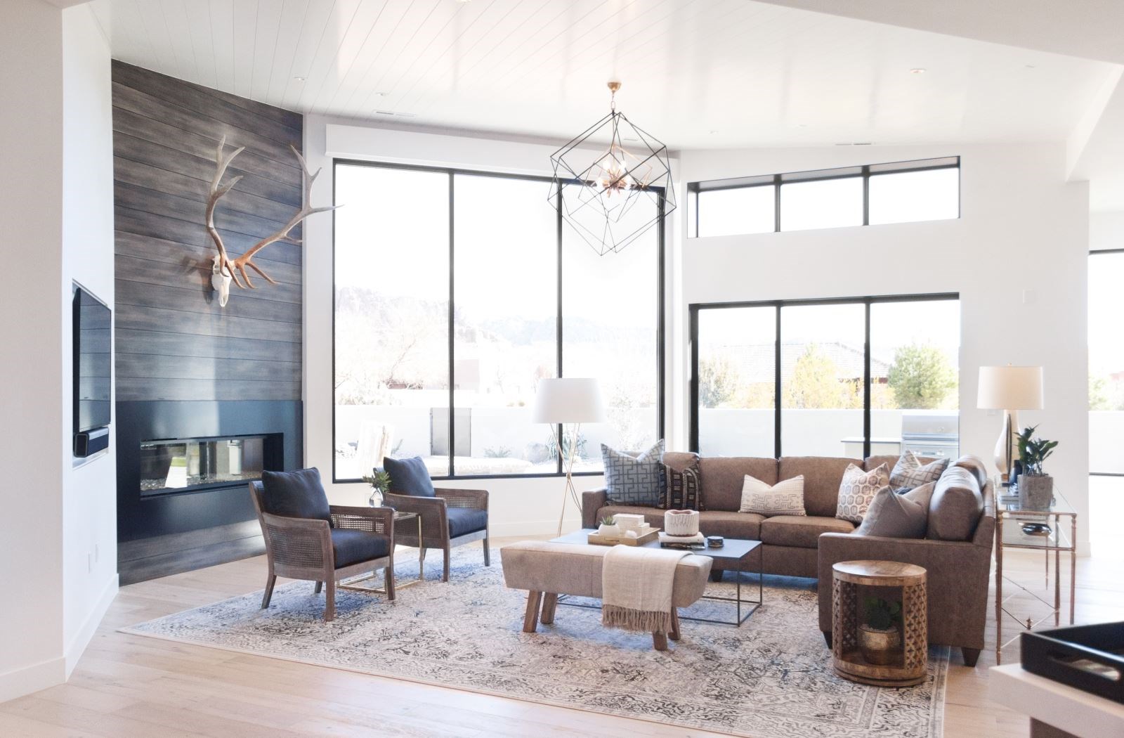
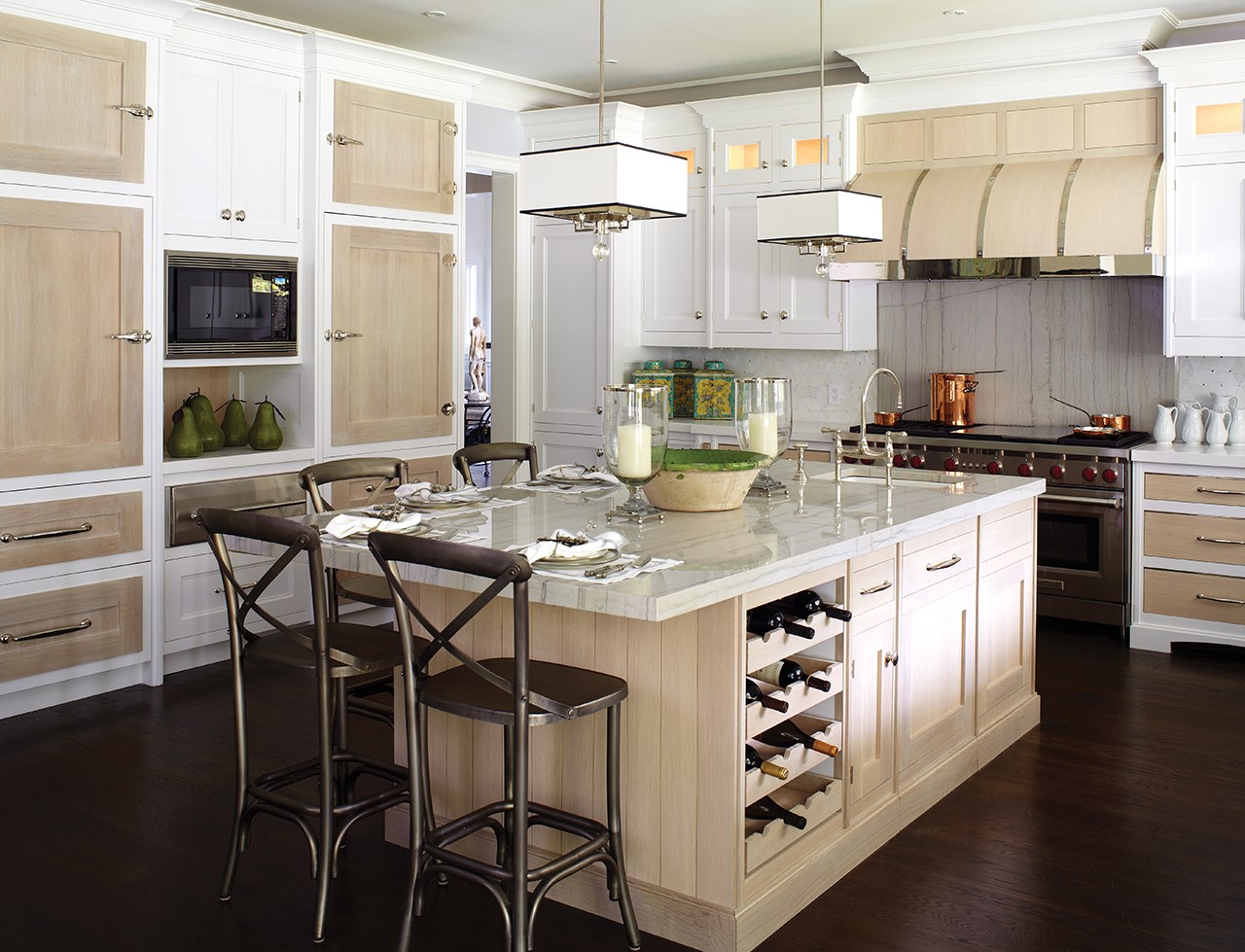
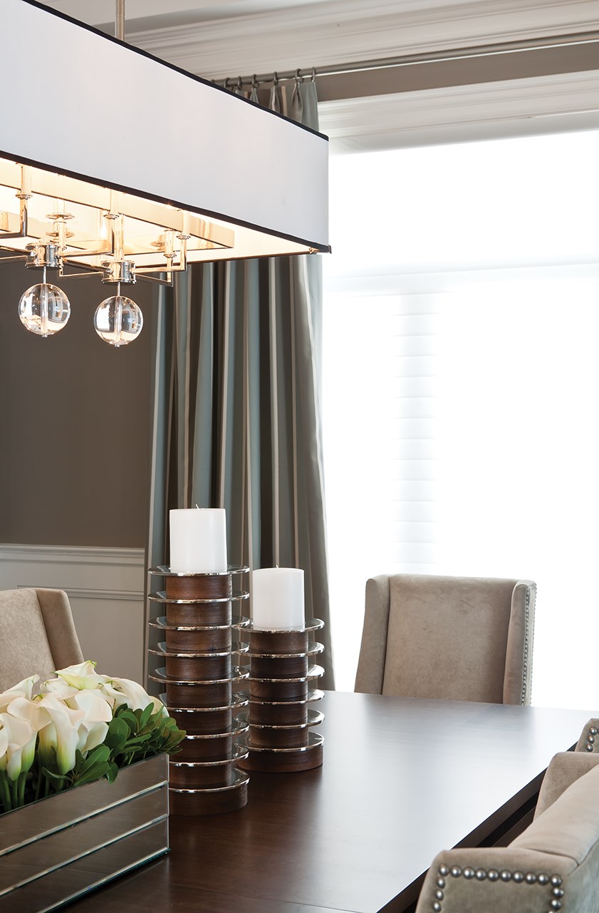
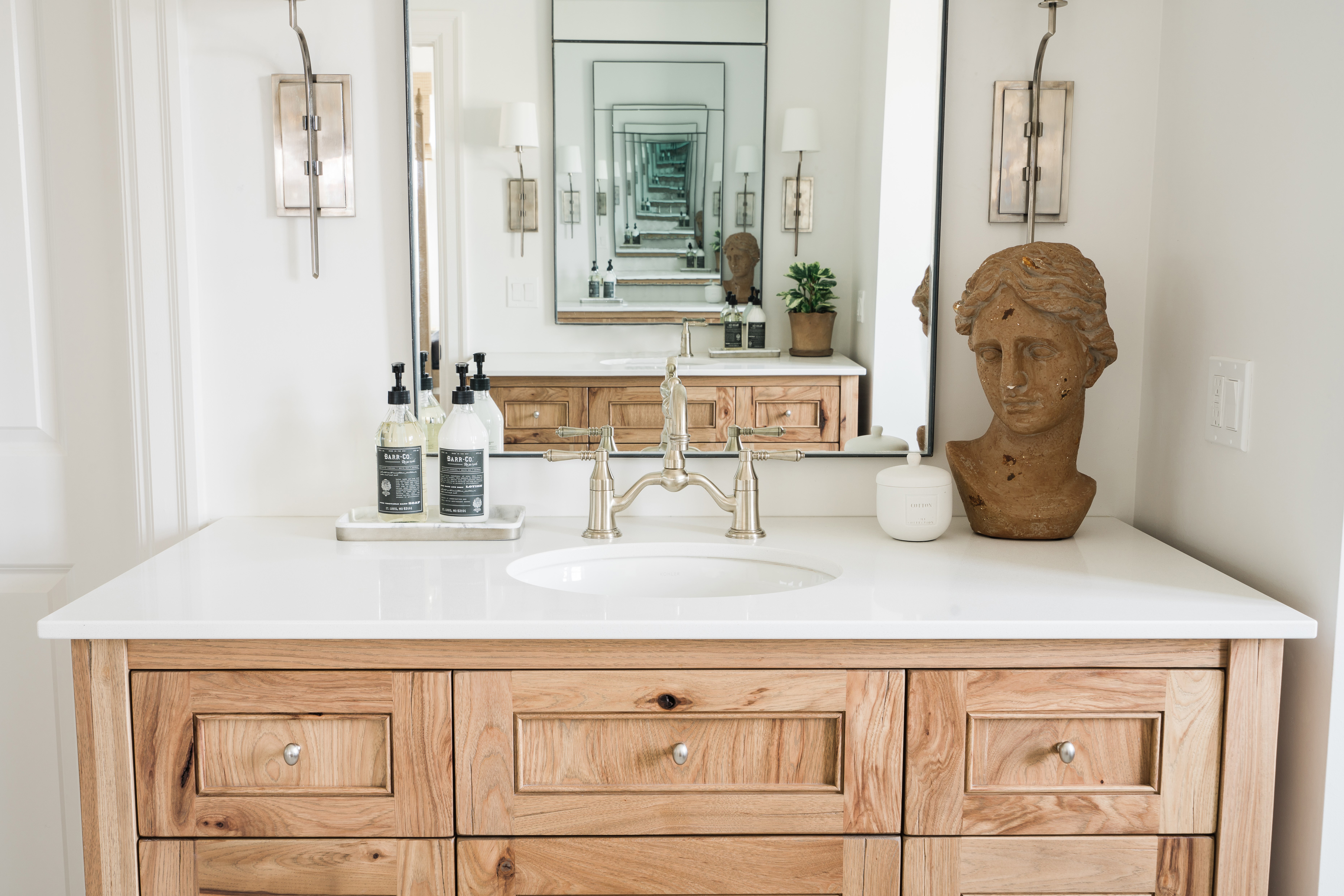
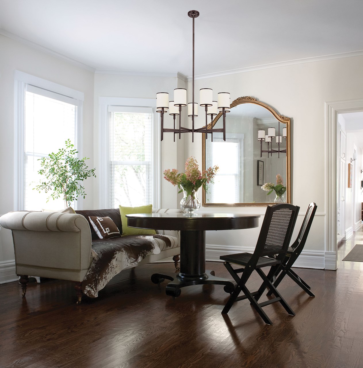
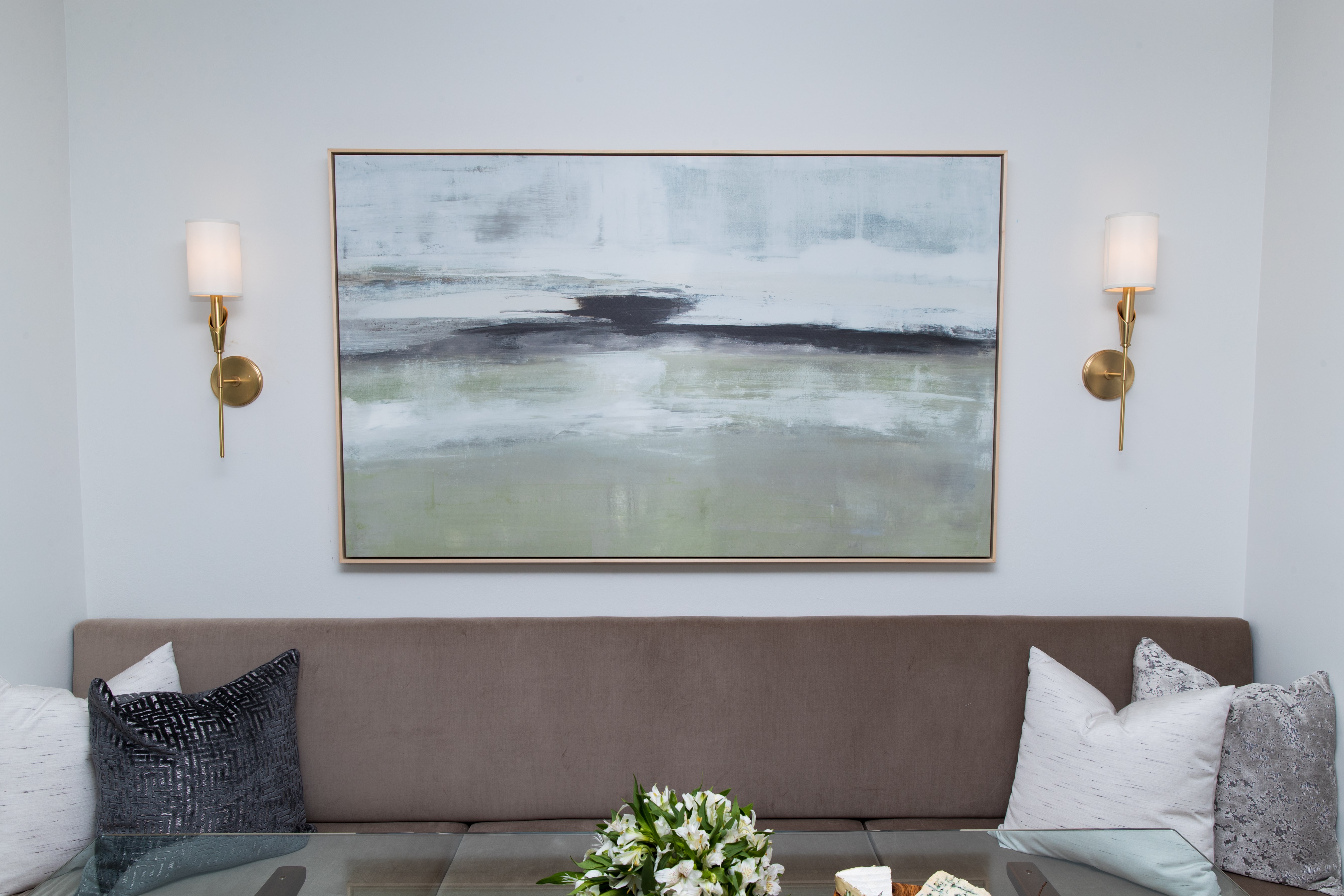
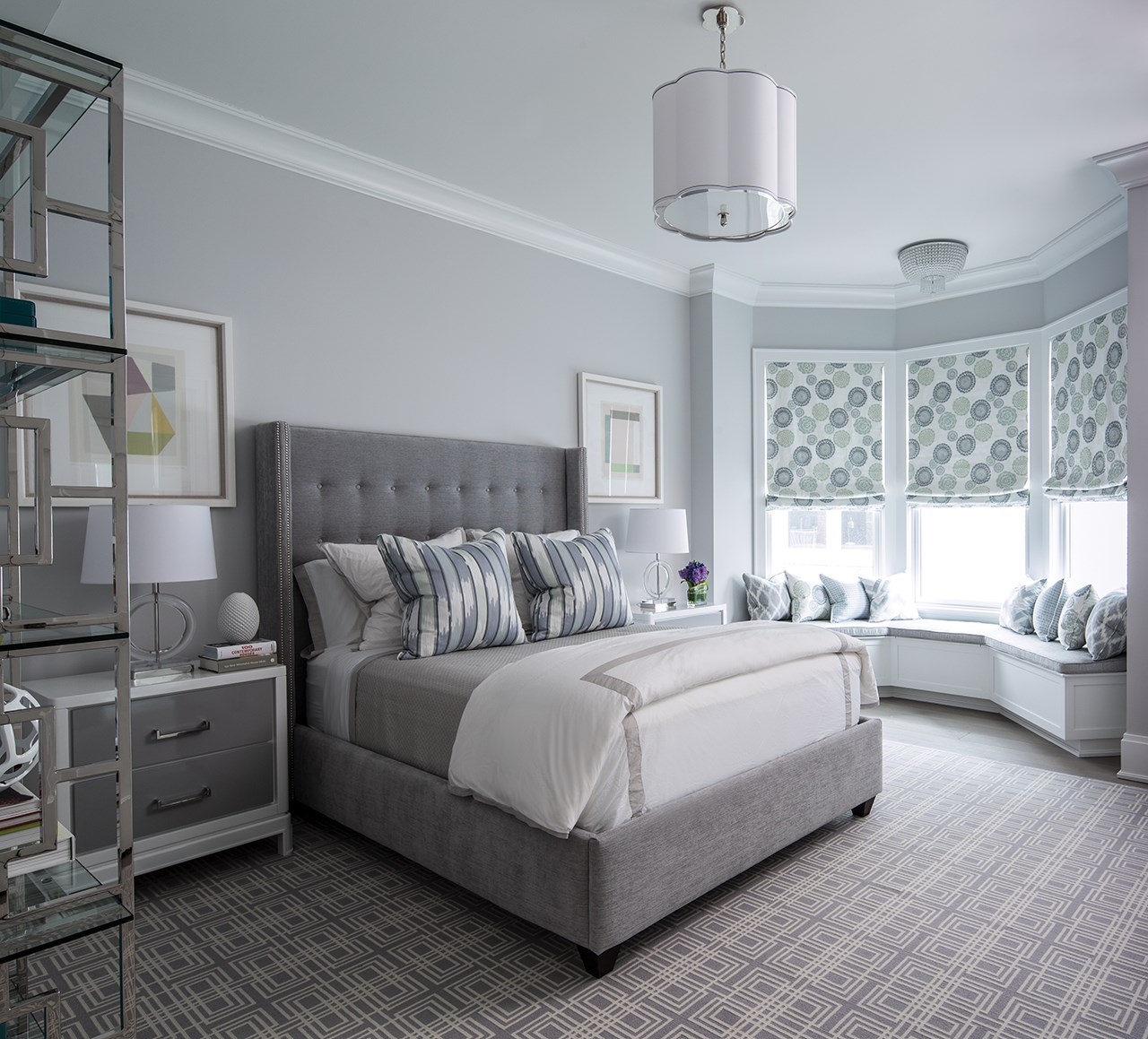
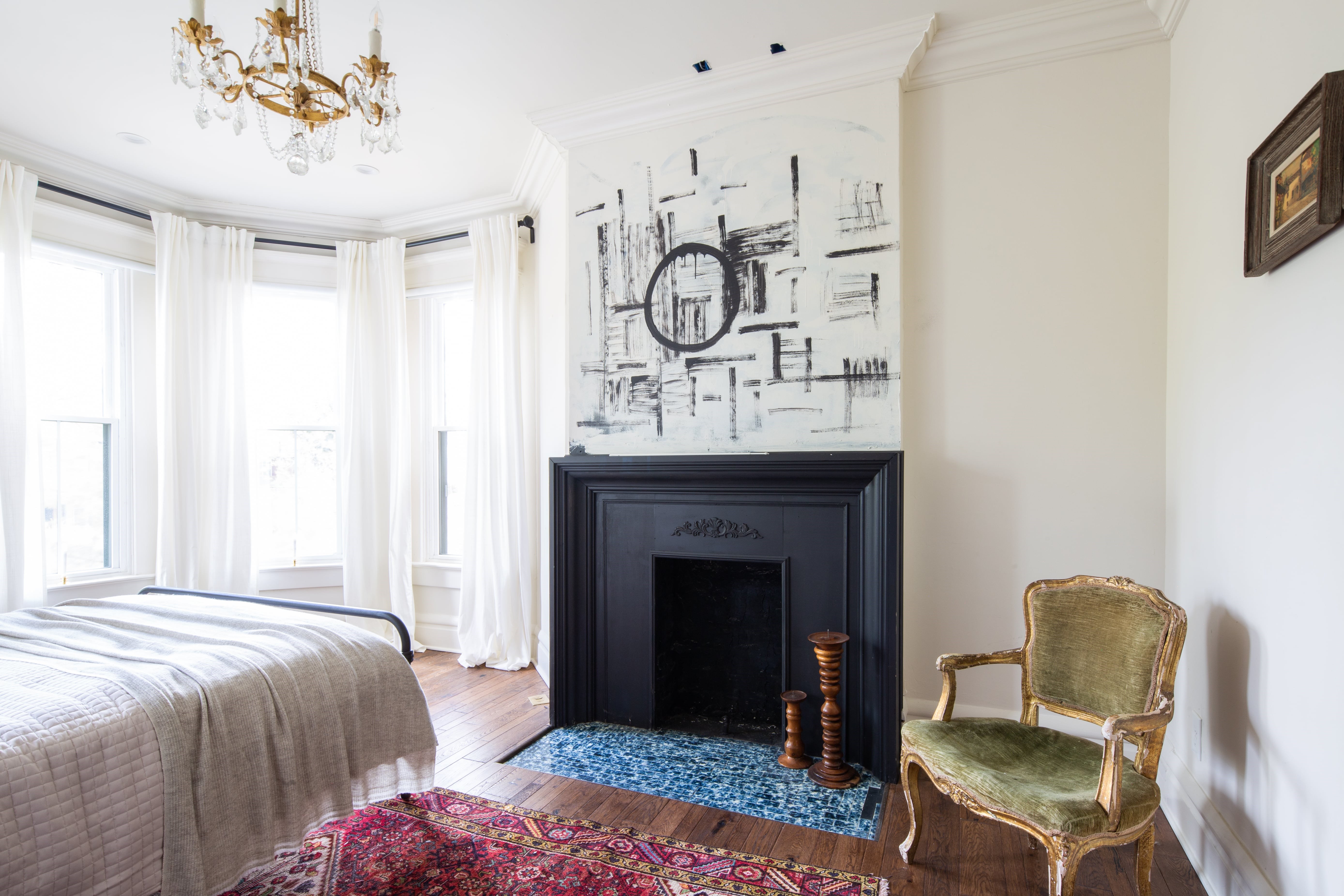
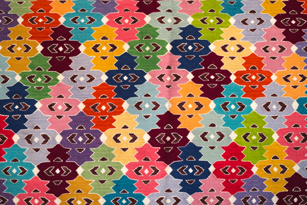
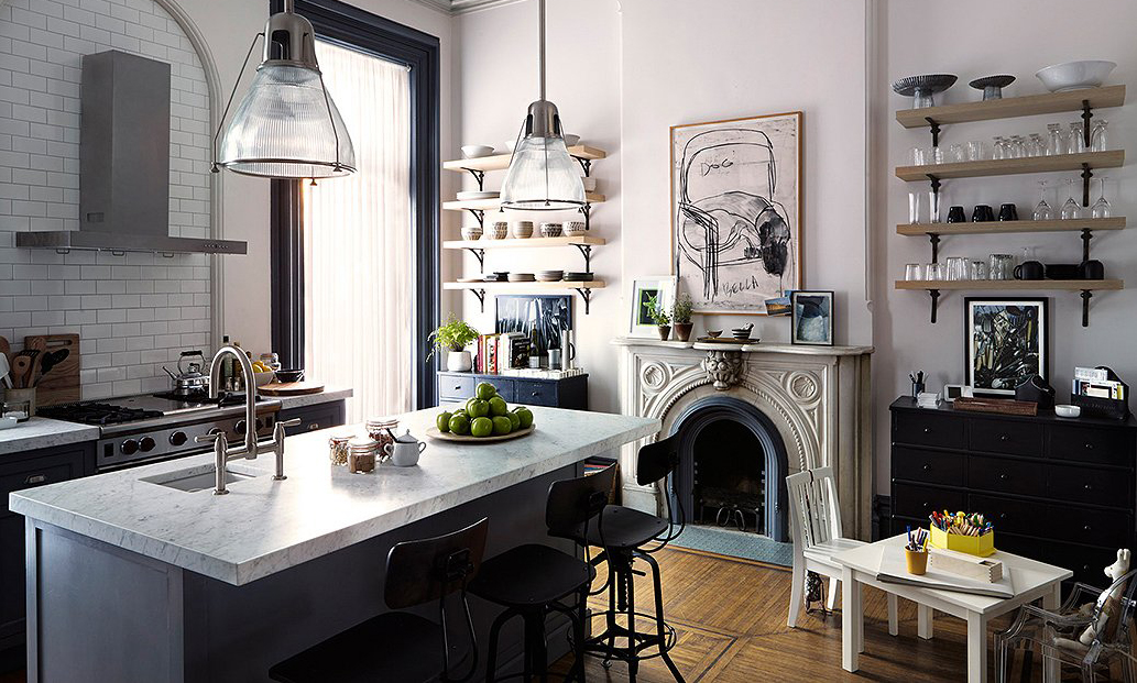
You know it when you see it. In fact, it's suggested that over half the images one sees online when searching interior design / decor images are this style. Houzz has 4021 "Stories" under this descriptor at last search. Beige or greige or off-white or otherwise neutral walls, a calming feeling. A sense of restraint and everything in its right place.

It's so ubiquitous it might seem odd there's even a name for it. That name is "transitional" and today we're going to break it down for you. Essentials meaning both the core things that define the style and some lighting options that epitomize the essence of transitional elegance.

It's an odd sort of word to apply to a home, a place associated with constancy. So what is it we mean when we say transitional about a home? On the way to where from where?

Put this way, transitional is located on the way from classic and traditional into the contemporary. It generally resists feeling dated as it's a constant sought-after style and doesn't chase trends. It follows certain rules struck upon through experience and careful study by professionals in interior design. 

After you're done learning about it, explore our transitional essentials here.   Let's get started!


Design: Signature Interior Design

Neutral color palette

An immediately identifying feature of transitional spaces is the color—or more precisely, the lack of it. Beige, grey, greige, any and all manner of white, off-white, cream: these are the sorts of hues used on the walls and ceilings. They continue onto backsplashes, tiling, and floors. Dark wood might dominate a floor in some spaces, but a large area rug which softens the mood and features these sorts of neutral hues will often cover much of it.

Transitional spaces aim to please. They seek to relax those who enter their confines. They create a sense of calm. 

Rarely is a bold color seen to pop or accent the space; never does one drench the room in mood. This neutrality means other elements will add drama. Or at least, transitional's version of drama, which might be, like, politely assertive. 


Design: Saltbox Collective

Curved furniture contrasted with straight edges  

Where there is no contrast, there is no design. Transitional interiors implement contrast mostly in the form of a curved vs. hard-edged dichotomy. Furniture with soft curves plays against straight lines and perpendicular angles in lighting, mirrors, artwork, and side- or coffee- tables.

The hard lacquered line of a mantel is an easy example of  an edged surface to balance a curvy couch. Moldings or millwork (not too fanciful) may continue this theme. Lacquered architectural features provide another soft contrast, this time the low-gloss luster of paint finishes on the walls.

A chandelier might integrate both the angles and curves, harmoniously tying this thematic element of the space together right in its scenter. Transitional essentials like our Chelsea  and Gresham Park embody this dynamic.


Design: Robin Nadel | Image: Ted Yarwood Photography

Masculine and feminine balance

Some refer to transitional style as a diplomatic one. Why is that? 

Well, it's because it feels crisp and tailored without dripping with one person's vision or personality.

As we discussed in our post on cohabitating, decorating a space so that the masculine and feminine aspects of two people's tastes are balanced in a harmonious whole is a challenge. The well-appointed room done in transitional styling has this balance built into it. See also: designer as diplomat.

Furniture choices, fresh flowers, perhaps a subtle textural element such as in an area rug, might represent the feminine, while color choices and tables and woods used express the masculine. Art and lighting are two areas where it can swing either way. The shape or color of some of our table lamps, for example, can provide accents that set the balance.


Design: House of Jade Interiors | Photo: Travis J Photography

A Little Texture

The goal of a transitional space is to feel relaxed. The room you're in is really put together, so you can feel put together, too. Pretty much every element in the space is aimed toward this. While certain other styles may also have a similar end in mind, transitional sets itself apart by lacking the curatorial, the trendy, and the clearly expensive. (Not that it avoids having quality items that come with an appropriate and consequent cost, but that they don't ostentatiously announce themselves as such.) It's unaffected. There is nothing pretentious or fetishistic about it.

To add a little pop to the space, and punch up the flat demeanor, use textures instead of color. Don't go overboard, though. Think of materials like rattan, chenille, quilted fabrics. Look for opportunities for subtle contrasts between textures and these neutral colors. For example, on a bed, that could be creamy off-white sheets folded over a grey or tan matelassé blanket. 


Artwork

As with any approach to decor, art is an essential piece. 

The selection and consideration of art changes with the mood your space is meant to evoke and your own passions. While in other styles, art may play a central, vital role, here it is more of an accent. Things like a matching series of prints, like a triptych, is a good idea. Again, strong, attention-grabbing colors are best avoided. 

This doesn't mean washes of watercolor or hotel art are the only option; handsomely framed linocuts or woodblock prints or even pencil sketches are all excellent choices. 

Framing should be minimal and matted. Baroque, gilt scrolling is verboten. These clear, clean lines and hard angles provide that orderly contrast to the space's more curvaceous elements.  


Design: Property Brothers

Window treatments

No window dressings leaves a transitional room feeling naked. In a stark way, not a sexy way. The answer to this is to ease up on the window treatments. As with everything else in the cool, calm, and balanced style, don't overdo it, but don't neglect it all together either.

Keep it crisp and trim with bamboo or Roman shades and unfussy beige floor-length fabric mounted hoop-on-rod. The rod you hang the curtains from provides another opportunity to infuse rooted earthy quality or a sense of warmth through an accent of dark metal in the room.


Design: Lauren Muse of Muse Interiors | Photography: John Bessler Photography

We hope you found that helpful. Hard to categorize, easy to spot, transitional style sets the scene for relaxed entertainment and daily recharge at home. 

Using a neutral color palette, a subtle use of textures, and an elegant contrast between curved surfaces and hard-edged lines, the transitional style results in calming and sophisticated spaces.

Finding light fixtures that tie into this scheme is essential. Many of ours fit right in, presenting refined, edited, and bold variations of transitional elegance. Additionally, they're built to last; their quality of construction is immediately apparent. You can browse through them here.


Design: Kristina Lynne of Kresswell Interiors | Photo: Tracey Jazmin Photography